Ping Identity // Risk Dashboard
I lead the data visualization projects across PingOne and PingID to design a modular, and flexible, set of dashboard components to be used across PingOne services. Depending on the service, some of the large view charts offered drill down tables to enable admins to discover what their traffic was doing coupled with extensive filtering capabilities. Prior to these efforts the company did not have any data visualization and only advanced reporting.
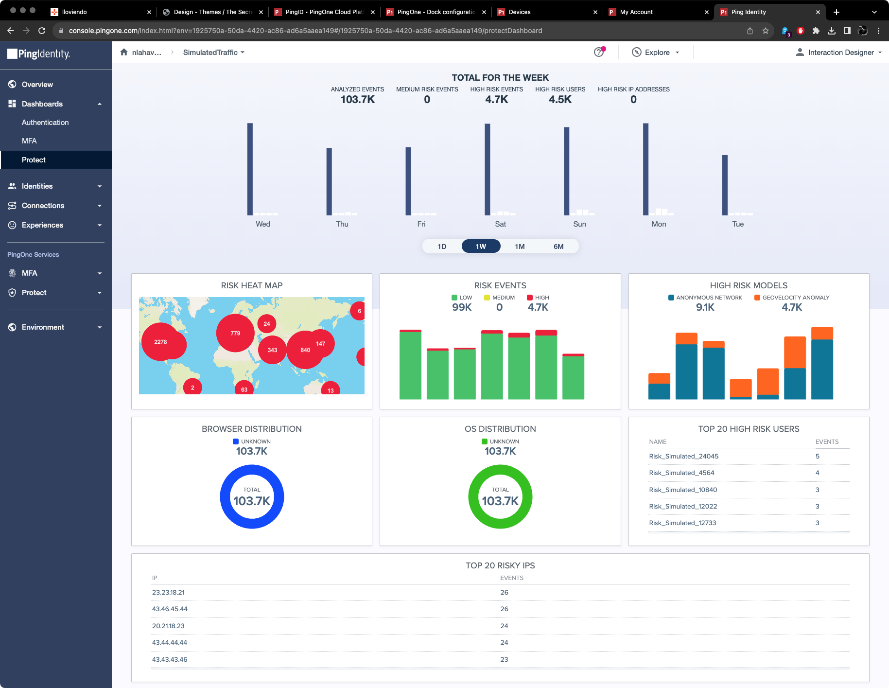
PingOne Risk (Protect) Dashboard
The main dashboard for Risk enabling an admin at a glance to see how their risk models are performing and to easily see a spike in risky events.
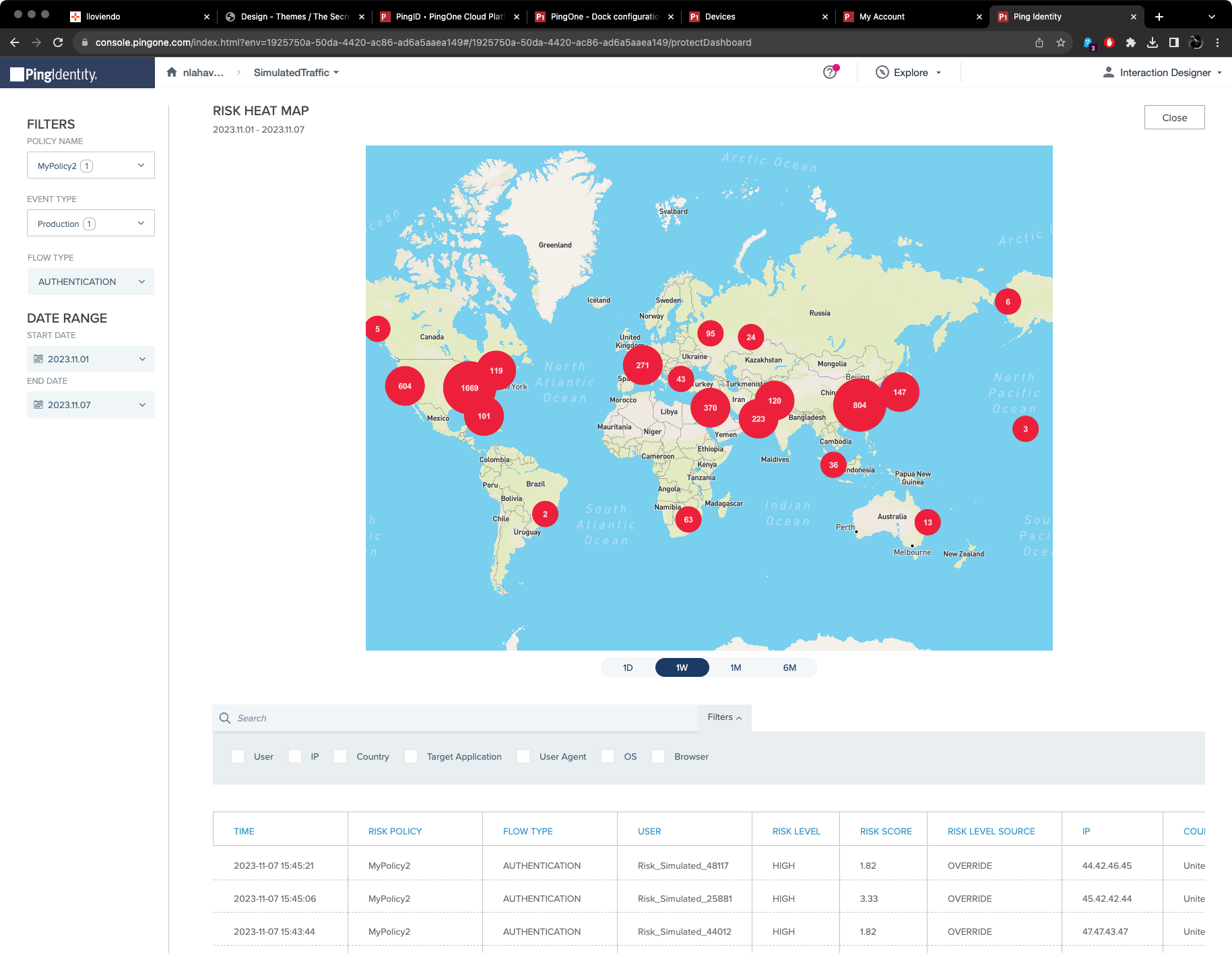
PingOne Risk – Heat map
This is the large view of the heat map with filtering to the left and a drill down table below. The chart itself is interactive and allows zooming in on events for further analysis.
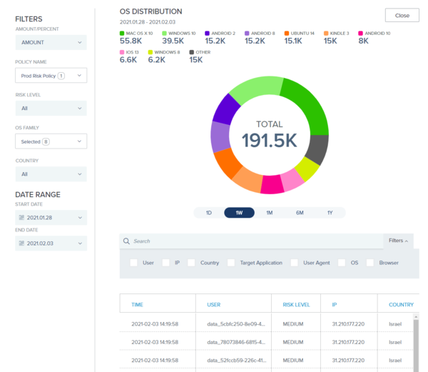
PingOne Risk – OS Distribution
The large view that shows more datapoints, filtering and a drill down table.

Risk Details
In the drill down table below the chart extended information is available per risk event enabling the admin to see exactly what triggered the risk event. This helps with assessing risk policy performance and adjustments.